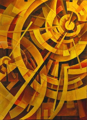
 This painting is nearing completion.
Tuesday, August 25, 2009
Monday, August 17, 2009
Journal Page
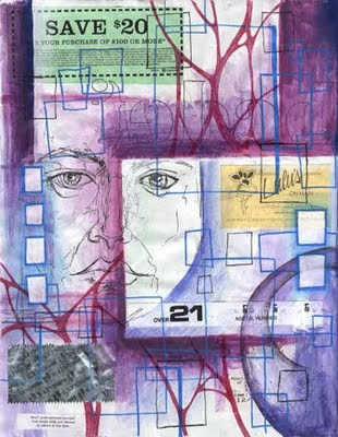 Page 2 in my current journal. It's been done for a while, but I haven't gotten around to posting it. There's no real theme or underlying concept. It's an accumulation of marks, media, fodder, and memories.
The Journal Fodder Junkies are now on Facebook. I'll be posting more updates there - such as upcoming events. Fans will be able to post images as well as messages. So, stop by and become a fan if you're on Facebook. If you're not, what are you waiting for. There's not a lot yet, but I just set it up over the weekend. Click the link to the right.
Thursday, August 13, 2009
Excavation
Tuesday, August 11, 2009
Create Your Perfect World
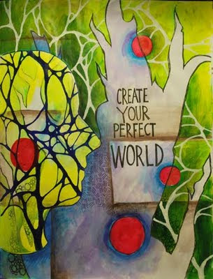 I feel that this page from my current journal is pretty complete. You may recognize it from an earlier post, but it has undergone a big transformation. This page began as inspiration from one of Steve's splotch monsters. I added a lot of watercolor pencil, pen, and ultimately acrylic paint. The paint makes if feel much tighter and more formal than many of my other pages. It's nice to mix it up. The quote "Create Your Perfect World" came from somewhere, but I can't remember. I guess I should acknowledge my sources.
Thursday, August 6, 2009
Life Gets Busy
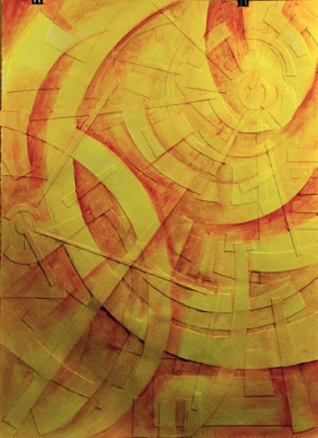
It is the same old story. Life gets busy and things fall by the wayside. With the end of the school year, teaching a summer program, finishing up the manuscript, and helping Dave move, I have not had much time lately. But I have started a relief painting, and wanted to share the beginnings of it. The idea grew out of the journal and could easily be adapted back into the journal.
Much of my work lately has been dealing with the layering of certain shapes and the sense of depth, overlapping, and transparencies. So I wanted to push this idea even further. By working with 22 in x 30 in heavy weight watercolor paper, I built up a very shallow relief by cutting shapes with a hobby knife and gluing the shapes down with gel medium. I then coated the whole thing with gel medium to create a consistent surface.
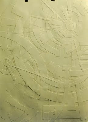
Trying to work with acrylic paint in a similar way as I do with watercolor pencil, I then used cadmium yellow, yellow ochre, and burnt sienna to accentuate and highlight certain areas as well as to begin laying in the bigger patterns of dark and light. I blended the paint out with matte medium to create very transparent areas.
Using burnt umber, crimson, and pthalo blue, I added more glazes of paint to bring in more contrast and to further develop the pattern of light and dark. I then used titanium white mixed with other colors to bring some highlights to certain areas, and used all the other colors to develop the forms within certain areas by mixing and blending.
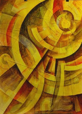
I've worked on it more since this last photo was taken, but the process has slowed down as I am beginning to tighten up and develop areas. I'll keep posting progress photos.
Much of my work lately has been dealing with the layering of certain shapes and the sense of depth, overlapping, and transparencies. So I wanted to push this idea even further. By working with 22 in x 30 in heavy weight watercolor paper, I built up a very shallow relief by cutting shapes with a hobby knife and gluing the shapes down with gel medium. I then coated the whole thing with gel medium to create a consistent surface.

Trying to work with acrylic paint in a similar way as I do with watercolor pencil, I then used cadmium yellow, yellow ochre, and burnt sienna to accentuate and highlight certain areas as well as to begin laying in the bigger patterns of dark and light. I blended the paint out with matte medium to create very transparent areas.

Using burnt umber, crimson, and pthalo blue, I added more glazes of paint to bring in more contrast and to further develop the pattern of light and dark. I then used titanium white mixed with other colors to bring some highlights to certain areas, and used all the other colors to develop the forms within certain areas by mixing and blending.

I've worked on it more since this last photo was taken, but the process has slowed down as I am beginning to tighten up and develop areas. I'll keep posting progress photos.
Subscribe to:
Posts (Atom)

